Criticism / Lee Konstantinou
:: A Theory of Here ::
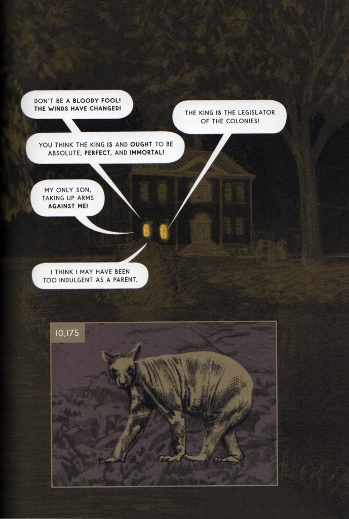
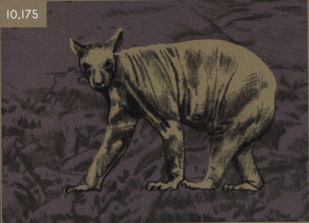
About halfway through Here, the experimental cartoonist Richard McGuire opens a window—well, a panel—onto the year 10,175. This far-future scene is layered atop a larger image that takes place in 1775, somewhere on the east coast of what will become the United States, showing a cryptic conversation about the pending Revolutionary War. By now, we’ve learned how to read Here. McGuire’s book—it would be a mistake to call it, as many have done, a graphic novel—scrambles the normal logic of comics narrative. Instead of creating juxtaposed sequences of panels that together tell a unified story, Here’s pages show the same location in space at different times. The book features a sequence of lushly colored double-page spreads, each one set in a different year (indicated with a tag in the upper-left corner of the page). Smaller panels often hover over the main double-page frame, depicting the same location either before or after the dominant year. Mostly, we observe the corner of a nondescript room, seeing how it stays the same or changes across the years, observing its various human inhabitants at different ages and in different states of health. These panels have, by the midpoint of the book, largely focused on the past and the present; McGuire has rendered times before the house was constructed, has dramatized encounters between the indigenous population and newly arrived settler-colonists, and has even let us see the year 1,009 BCE. We have also already peeked into the house’s future, observing humans who inhabit the year 2016 (residents of this distant future seem very much like us), as well as people using holographic interfaces in the year 2050. So the attentive reader has probably already anticipated that McGuire will show us the ultimate fate of the house—perhaps letting us see far beyond. And he does. But what we see of the year 10,175 is far stranger than we might have expected.
Figure 1: McGuire’s far-future marsupial
This unassuming panel, about the size of a playing card, opens onto an animal, a marsupial of some sort, maybe the lovechild of a large possum and a small kangaroo, standing on an empty field. It’s not any animal that exists today, and not an animal we would expect to see in the American northeast. The creature stares straight at us, as if it knows we’re watching, suggesting that it might be more intelligent than your average marsupial. The animal’s confident gaze is initially unsettling and comes to seem alien precisely because the animal itself is so ordinary, so unthreatening. With this innocuous panel, McGuire opens up a new continent of time, suggesting that the second half of Here will more fully explore the ultimate fate of the house. And again, Here does not disappoint, showing us the house’s frightening destruction by (presumably global-warming-related) flooding, taking us as far forward as the year 22,175, where new dinosaur-like creatures roam the earth. And yet there is something uniquely affecting about this particular marsupial, something about it that is even stranger than the later dinosaur-creatures, something about its haunted eyes that gives us access to the larger, unnerving significance of McGuire’s masterwork. This little animal perfectly illustrates how McGuire uses comics to explore the relationship between time and space.
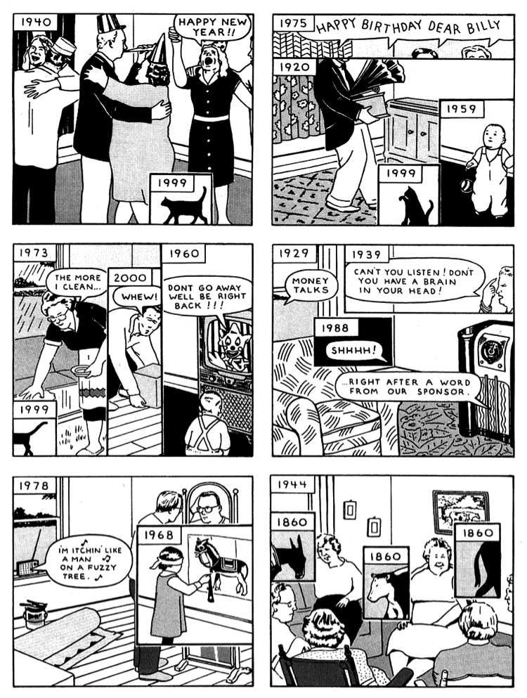
McGuire first published “Here” in 1989 in Raw, an avant-garde comics magazine created by Art Spiegelman and Françoise Mouly. Only six pages long, the original “Here” electrified the tiny world of experimental comics. It was warmly received by long-established Underground cartoonists like Justin Green and, most importantly, hugely influenced younger cartoonists like Chris Ware. [i] The French comics critic Thierry Groensteen has been extolling its praises for years, writing one of the first analyses of “Here” in 1991. [ii]
Figure 2: A page from McGuire’s 1989 “Here”
The 1989 version of “Here” is superficially similar to the book. Each panel features a dominant image of the corner of a room overlaid with smaller panels displaying other images, images of the same room in the past and the future. Like the book, the panel-windows jump around in time and, taken together, don’t tell a unified or straightforward story, though we do get to see the whole life of a character named William, born in 1957, dead in 2027. Instead, McGuire tells the story of the room itself (much like Ware tells the story of a single building in Building Stories). More importantly, “Here” has a story to tell about the relationship between time and space. In McGuire’s experiment, space and time together form a unified four-dimensional block, and “Here” gives us interesting cross sections of that block. We may experience time as a mundane sequence of moments, McGuire seems to argue, but we should not forget that other times are equally real, existing where (if not when) we stand. What has made this six-page comic so appealing to form-conscious cartoonists is, I think, the brilliantly simple device that McGuire devised to communicate his core idea. Panels within panels: before you see what McGuire does with it, you wouldn’t have expected such a simple—even obvious—device in the cartoonist’s toolkit to be so powerful.
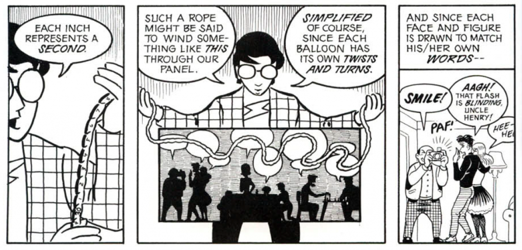
Panels are, if you think about it, a pretty strange weapon in the cartoonist’s representational arsenal. They depend on creating two types of representational confusion. First, the individual panel creates an illusion of opening onto a scene without obtruding into it. It invites comparison to the cinematic frame, and one often finds critics using the visual vocabulary of film staging to describe particular moments in comics. Like the photographic image, the individual panel can seem to render frozen instants of time. But, as Will Eisner notes in Comics and Sequential Art, the panel is much more than a technical device. It is “part of the creative process, rather than result of technology” (38). The panel is just as much an icon—and requires just as much thought—as the cartoon figures within the panel, and the best cartoonists know this, manipulating panel shape, size, and border weight to create different moods and aesthetic effects. Moreover, as Scott McCloud shows in Understanding Comics, time works in a funny way within panels (96). Any seemingly still moment within a panel is actually internally divided, consisting of a temporal sequence. But in order to read comics, we often suspend our awareness of this sequence.
Figure 3: Scott McCloud on Intra-Panel Time
The sequential arrangement of panels invites a second helpful confusion: the confusion of reading comics with reading text. It is easy to participate in this confusion because panels are usually organized roughly into reading order, from left to right, top to bottom. We are invited to imagine that the order of reading corresponds to the progression of a film strip, that every new panel, with the exception of flashbacks and other overt breaks in linear storytelling, moves us inexorably forward in narrative time. And most of the time, this is the case. Avant-garde comics, however, such as those collected in Andrei Molotiu’s Abstract Comics anthology, tend to challenge the assimilation of panel order to reading order.
Figure 4: From Ibn al Rabin, Cidre et Schnapps, reprinted in Molotiu’s Abstract Comics
Panels continue, in many of the comics that Molotiu collects, to create a rhythm of reading (and without this visual rhythm it would be hard to differentiate these abstract comics from painting). But Molotiu’s anthology also draws our attention to the fact that the comics page can achieve design effects that transcend those created by reading panels in a strictly linear sequence. This is the property of the comics page that Groensteen calls “iconic solidarity,” which he defines as the capacity of comics to create “interdependent images that, participating in a series, present the double characteristic of being separated … and which are plastically and semantically over-determined by the fact of their coexistence in praesentia” (18). Panels in sequence, panels that seem to portray time’s movement, can actually become meaningful in terms of their spatial relations. It’s as if all of the panels on the page were occurring at the same time or momentarily transcending time. So time and space have a funny relationship on the comics page. Static moments seemingly captured by the panel always necessarily contain their own past and future; and temporal sequences across panels always necessarily form larger spatial units of meaning that transcend the succession of time. But to read the overwhelming majority of comics, we are required to forget these truths, or at least temporarily to suspend our awareness of them. What McGuire’s panels-within-panels do is make the unintuitive commingling of time and space on the comics page—and the falseness that characterizes a surface-level reading of comics narrative technique—exquisitely clear, turning this commingling into an object of aesthetic pleasure. This is the genius of the core device of “Here.” Twenty-five years on, McGuire’s book-length update to his revolutionary six-page comic raises a variety of questions. If the original had such a huge impact, what is left for the book to do? Does Here move beyond “Here,” or simply bring the shorter comic’s brilliance to a wider audience (which would itself be a worthy goal)? Does McGuire deepen or reconsider the temporal philosophy of the original “Here”? And if comics are a “way of thinking,” to paraphrase Chris Ware, what exactly is Here thinking about? (Ball and Kuhlman xix)
*
Figure 5: A double-page spread from McGuire’s 2014 Here
One thing Here is thinking about is the relation of comics to digital technology. We might say that Here teaches us that comics is—or at a minimum is becoming—a newly digital medium. Discussing contemporary notions of textuality in Digimodernism, Alan Kirby brings together two senses of the term “digital,” noting “the centrality of digital technology” for contemporary artists as well as “the centrality of the digits, of the fingers and thumbs that key and press and click in the business of material textual elaboration” (51). This might seem like an unfortunate pun (and it is), but it’s a pun that is nonetheless helpful to keep in mind when reading the new version of Here. After all, comics is nothing if not a finger-obsessed medium: it invites manipulation by our digits: flipping, folding, pointing, fondling, stroking, even ripping.
The reader’s capacity to touch pictures, the physical weight of the book in our hands—that is, the haptic dimension of comics—is part of what has historically distinguished the medium from other representational art forms and is one reason comics can so successfully combine the visual urgency of film with the emotional intimacy of the novel. It is only slightly an exaggeration to say that comics is an art of touching. And the best comics have often sought to activate our awareness of their haptic materiality. At the same time, comics is also becoming digital in the technological sense. Like every other art form, it is being subsumed by digital technologies, but—again like every other art—it is becoming digital in its own strange way. There’s even an iPad version of Here, which allows readers to manipulate panels showing different times.
Figure 6: Richard McGuire’s recent New Yorker cover
But Here’s concern with digital computers is not just a matter of its (seemingly inevitable) digitization. Rather, digitization is visible even in the dead-tree version of Here, in the form of concepts drawn from the history of graphical user interface (GUI) design. At least since Vannevar Bush first described the possibility of his imaginary Memex machine in the pages of the Atlantic Monthly and Ivan Sutherland, inspired by Bush, created the influential Sketchpad program in 1963, the history of digital computers has been, in part, a history of the schemas, metaphors, and mediating concepts that have been designed to guide our relationship to technical systems and to mitigate the intimidating abstraction of the machine.
Figure 7: Ivan Sutherland’s Sketchpad
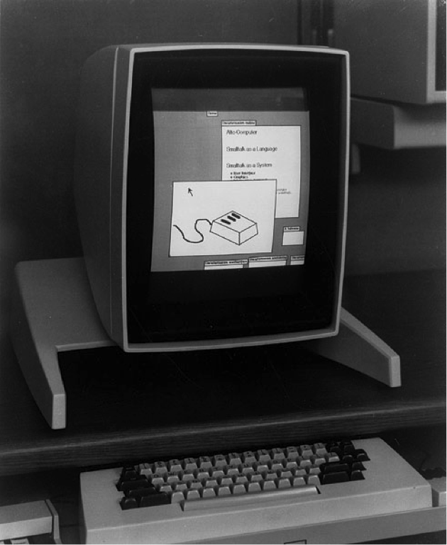
As the science fiction writer Neal Stephenson has pointed out, our dominant operating systems have long relied on metaphors—mostly visual metaphors—to make computers accessible (3). So it should come as no surprise that concepts developed for the design of graphical user interfaces can migrate onto the pages of comics and (in the case of the iPad version of Here) back again. And indeed, one of the original inspirations for the 1989 version of “Here” was the windows-based GUI popularized by Apple and then by Microsoft, which was in turn inspired by (or you could say stolen from) Xerox PARC’s groundbreaking Xerox Alto, the first computer to use a desktop metaphor to govern user interactions.
Figure 8: The Xerox Alto
(The Xerox Alto itself drew on concepts previously developed in Douglas Engelbart’s oN-line System. Take a look at Engelbart’s 1968 “Mother of All Demos” if you want to see how genuinely non-innovative modern UI design is). All of this design engineering was, of course, an important part of the history of computation, but it was arguably even more important as part of the history of what we might call applied epistemology. How, GUI designers were forced to ask, can the abstract world of the machine, the impersonal realm of the microprocessor, be made accessible (especially to non-engineers)? But when we begin thinking of GUI design as applied epistemology, it quickly becomes clear that visual metaphors do not eliminate abstraction but rather substitute one kind of abstraction for another, one representation scheme for another. A term like “accessibility” is a deceptively simple word, whose seeming transparency obscures important assumptions about the relationship among persons, machines, and the world. As has often been noted, the metaphor of the desktop—or the notion of storing data in discrete objects we call “files”—encodes all sorts of norms guiding how humans and machines interact, suggesting that the personal computer is first and foremost a work machine, a machine for people imagined as workers.
The figure of the window, meanwhile, is a spatial translation of human-machine interaction, compartmentalizing user attention, imagining the user as engaged in a workflow of switching between windows (discrete attention-states), bundling together tasks that software designers decide belong together, and facilitating user multitasking. Though software designers influence what we see, what tasks we are meant to associate together, the windows metaphor invites us to imagine that we users have a certain kind of agency, that we have the opportunity to manage our own attention, that we can simply look out of this or that window, by choice, whenever we want to. Windows evoke our existing sense of volition (we feel we are choosing to look out this window rather than that window) while also reifying the technical systems we’re encountering along particular lines (the contents of the window in question are naturalized, like the landscape or cityscape we observe from the comfort of our home). So at the same time that UI research addressed itself to the problem of giving humans access to a seemingly impersonal, technically unwelcoming realm, it also shaped that interaction toward particular use cases and has invited us to accept what the machine serves up as given, natural, and beyond our ability to change outside prescribed bounds. The machine becomes both more accessible and—as anyone who has too many windows or too many tabs open right now knows—quickly overwhelming.
One of McGuire’s original insights was that these technically implemented figures—metaphors designed as the solution to problems of human-machine interaction—were portable and fungible. “Here” appropriates the windows metaphor for new, but related, ends. In McGuire’s hands, windows organize another sort of inhuman vastness: the incomprehensible vastness of time. Where windows-based GUIs unintentionally lead the user from a feeling of mastery (one window open) into a feeling of drowning (way too many windows open), McGuire’s little windows pile up individually accessible, even semi-autonomous moments that in aggregate snow the reader under the hideous size of time. In the original “Here,” Deep Time comes in hand, becomes digital. Today, our technologies of human-machine interaction have shifted and so too has McGuire’s approach to the digital potential of comics. The most significant transformation of human-machine interaction since the creation of the modern GUI is almost certainly the rise of ubiquitous mobile computing. Bush described his Memex, after all, as “a desk … primarily the piece of furniture at which [the user] works.”
Today, we carry our tiny, sleek desks inside our pockets. We wear them on our wrists. And we may, soon enough, slap them onto our faces. This mobile revolution builds, of course, on what already exists. Our little pocket desks, running iOS and Android operating systems, still depend on various desktop-like and windows-based metaphors. We often still work with “files” that we occasionally toss away into the “trash” or a “recycling bin.” What is different, though, is the increasingly salient possibility that mobile devices might build a layer of information atop reality, that visual figures designed to interact with machines might profoundly reshape how we figure other dimensions of reality. As one character announces in William Gibson’s 2007 novel Spook Country, cyberspace is “everting” or colonizing the world (28). Whereas Gibson’s early novels focus on hacker anti-heroes who enter the machine, navigating its sublime, unnerving datascapes, his more recent books have been focused on how machines have transformed his characters’ modes of embodiment within what we used to naively regard as the reality outside the computer. In the near term, this set of transformations may give rise to full-blown augmented reality systems that use various visual metaphors to layer data dynamically atop the world. Whereas once upon a time we looked out from our comfy rooms through clearly designated “windows” onto something we could well mistake for an outside world, today the room and the world have almost seamlessly merged. The world itself has become our office, and we are now, forever, chained to the desk. This, at any rate, seems to be the new ideology of user-interface design.
This ideal—the confluence of ubiquitous mobile computing and augmented reality—becomes the new digital horizon for Here. The book features several sequences set in the twenty-third century, in which a hologram or android leads a group of tourists on a tour of the site of the now-destroyed home. The tour guide has a fan-like device that projects holographic windows showing the past. The members of the tour group are ethnically ambiguous but visually resemble the Native Americans who were previously displaced by white settler-colonists. This tour becomes, to some degree, the motivating narrative device of the book. What the tourists are experiencing is nothing other than a version of Here itself.
Figure 9: The Fan
We might read this tour not as the triumph of the ideology of mobile computing but as the restoration of what was lost, as a return of the indigenous population to the land that was taken from them after the rapacious civilization that displaced them inevitably destroyed itself. But our consolation (if we find such a violent fate consoling) does not last long. Though we get a glimpse of what might be some sort of utopian future, Here’s human story ultimately stands against a stark background largely devoid of human presence. That is, a yawning cosmic indifference bookends the life of McGuire’s little house. Beginning from the affordances of our own primitive augmented reality technology—the iPad on which we might be reading Here itself—McGuire wants to give us access to what we might ordinarily find difficult to keep in view: the non-human background upon which life unfolds, the inanimate world upon which life finally depends. McGuire wants us to imagine comics as a sort of mobile device that opens up temporal vortexes, digitally extending the human mind, helping us confront the universe’s indifference to us. Comics might train us to adopt habits of mind, an orientation toward the world, that brings the past and the future—the extreme past, the extreme future—precipitously into the present.
Figure 10: The Marsupial
This is, I think, the ultimate significance of McGuire’s bizarre marsupial. It’s an imaginary creature that helps us enter into something like a relationship of recognition with the vastness of the nonhuman world. If this is true, it would not be too pretentious to say that, in the eyes of McGuire’s alien animal, we observe the deconstruction of time.
And I do not mean the term deconstruct loosely here. Rather, I have in mind Martin Hägglund’s provocative reconstruction of Derrida’s thought in Radical Atheism. Hägglund describes a temporal logic, which he regards as filling out Derrida’s understanding of the relationship between time and space, in which all presence—everything that is seemingly present—is necessarily divided within itself. Kant’s transcendental categories, space and time, are always, in Hägglund’s view, co-implicated. Time always becomes space and space always becomes time, a process that Hägglund prefers to call the “spacing of time,” which is in his view “an ‘ultratranscendental’ condition from which nothing can be exempt” (19). Any “here” can only be “here” by virtue of its extension in time. Any “now,” likewise, is divided between a past moment (visible as a trace) and the future unmaking or transformation of that trace. Time can only be registered by the spatial means of the trace, and all traces are necessarily destructible, which implies that the future is radically open, that all positive structures or values can become negative.
“To think the tracing of time as the condition for life in general,” Hägglund writes, “is to think a constitutive finitude, which from the very beginning exposes life to death, memory to forgetting, identity to alterity, and so on” (79). This notion—the notion of “autoimmunity”—holds that “everything is threatened from within itself, since the possibility of living is inseparable from the peril of dying,” and that, moreover, “[w]hatever is desired as good is autoimmune, since it bears within itself the possibility of becoming unbearably bad” (9) It is a destructibility that—because it depends on the concept of the spacing of time—uncannily mirrors the imbrication of time and space within and between panels that I reviewed above. I am not, I should make clear, suggesting that McGuire was familiar with Hägglund or Derrida but am rather observing a family resemblance between their understandings of the relationship between time and space. More so than the original Raw six-pager, the book version of Here dwells on the radical (because intrinsic) destructibility of life.
McGuire’s interest in his marsupial, I would finally insist, isn’t predictive, any more than any other future scenario in the comic is predictive. He’s not telling us to expect odd kangaroo-like future animals but is rather asking us to think differently about what we might call the logic of temporal succession. If time is radically open, if everything that is good or desirable might be—by necessity—revealed to be bad, it is not at all clear how we might (or should) relate to this anteater creature that chews on our remains, or how to feel about the flood that destroys our home, or what to make of the tour group looking back upon us with the help of a holographic fan. In this way, McGuire cuts against the optimistic, technophilic assumptions that governed the original GUI engineering he was, however indirectly, inspired by. After all, the ultimate promise of windows-based interfaces or augmented reality is a happy reconciliation between human and machine. Good design supposedly makes what is alien, inaccessible, or abstract come (often literally) into hand. It promises to domesticate an unruly non-human reality. But these promises seem hollow in McGuire’s hands. Instead, his user-friendly windows open onto the ambivalent logic of autoimmunity. In Here, here always slips away, necessarily only ever exists in relation to various nows.
Such a way of understanding the relationship between time and space does nothing to obviate what we understand to be our ordinary or everyday experience of life. It doesn’t mean that we should look forward to our own destruction by climate change or throw up our hands despondently. What Hägglund calls “radical atheism” should therefore not be mistaken for quietism. Nothing, as far as I can tell, follows politically from this philosophical position except the sensible view that no political struggle comes with guarantees. Indeed, one might argue that the very possibility of caring about the future, of being invested in one outcome over another, depends on a prior condition of destructibility, the necessary truth that we can lose everything. On this view, our awareness of our inability to inhabit these larger temporalities or histories—our awareness of our own destructibility, the necessary destructibility of everything—is the very basis of mourning.
Mourning, Hägglund writes, is “a force that cannot be overcome and that emanates from the love of what is mortal” (110). Whether or not we find this account philosophically compelling, it is precisely such a love of mortality—the persistence of this love not despite but because of the possibility of self-destruction—that McGuire’s art elicits. Here is, I think, most emotionally gripping when it compels us to realize how (forgive the pun) comically small-minded our normal, habituated understanding of life is, how out of touch we are with historical forces (or with non-human temporalities), and yet how little guidance Here’s grand view of Deep Time offers to the necessary, daily project of avoiding self-destruction. It is a bracing, deflating insight that comics, in the hands of a master like McGuire, is uniquely suited to argue for.
Notes
[i] See Chris Ware, “Richard McGuire and ‘Here’—a Grateful Appreciation,” Comic Art 8 (2006): 5–7.
[ii] Thierry Groensteen, “Les lieux superposés de Richard McGuire,” Urgences 32 (1991): 95–109.
Works Cited
Bush, Vannevar. “As We May Think,” The Atlantic. July 1945. Web. 28 Mar. 2015.
Eisner, Will. Comics and Sequential Art. Tamarac, FL: Poorhouse Press, 1985. Print.
Gibson, William. Spook Country. New York: Putnam, 2007. Print.
Groensteen, Thierry. “Les lieux superposes de Richard McGuire.” Urgences 32 (1991): 95–109.
–. The System of Comics. Trans. Bart Beaty. Jackson, MS: University Press of Mississippi, 2007. Print.
Hägglund, Martin. Radical Atheism: Derrida and the Time of Life. Stanford: Stanford University Press, 2008. Print.
Kirby, Alan. Digimodernism: How New Technologies Dismantle the Postmodern and Reconfigure Our Culture. New York: Bloomsbury, 2009. Print.
Kuhlman, Martha B., and David M. Ball. “Introduction: Chris Ware and the ‘Cult of Difficulty.’” In The Comics of Chris Ware: Drawing Is a Way of Thinking. Eds. Ball and Kuhlman. Jackson, MS: University Press of Mississippi, 2010. Print.
McGuire, Richard. Here. New York: Pantheon, 2014. Print.
–. “Here.” Raw 2, no. 1 (1989): 69–74. Print.
McCloud, Scott. Understanding Comics. New York: Harper Perennial, 1994. Print.
Molotiu, Andrei. Abstract Comics. Seattle, WA: Fantagraphics, 2009. Print.
Stephenson, Neal. In the Beginning…Was the Command Line. New York: William Morrow, 1999. Print.
Ware, Chris. “Richard McGuire and ‘Here’—a Grateful Appreciation.” Comic Art 8 (2006): 5–7. Print.
Figure 1: McGuire, Here, n.p.
Figure 2: McGuire, “Here,” in Raw, p. 70.
Figure 3: McCloud, Understanding Comics, p. 96.
Figure 4: Ibn al Rabin and Cidre et Schnapps, “N’ergotons plus, je vous prie,” Les Éditions Atrabile. <http://www.atrabile.org/ibn-al-rabin/Fanzines/fanzine.php?titre=CidreEtSchnaps&page=17>. Rpt. in Abstract Comics, by Andrei Molotiu (Seattle, WA: Fantagraphics, 2009) 63.
Figure 5: Here, n.p.
Figure 6: Richard McGuire, “Time Warp,” New Yorker 24 November 2014 <https://www.newyorker.com/wp-content/uploads/2014/11/CoverStory-Time-Warp-Richard-McGuire-872‑1200-13173805.jpg>.
Figure 7: Ivan Sutherland, Sketchpad: A Man-Machine Graphical Communication System <http://www.wired.com/2013/01/grandaddy-gui/>.
Figure 8: “Xerox Alto” <http://toastytech.com/guis/altost1.jpg>.
Figure 9: Here, n.p.
Figure 10: Here, n.p.
Lee Konstantinou is an assistant professor in the English Department at the University of Maryland, College Park. He wrote the novel Pop Apocalypse (Harper Perennial, 2009) and co-edited with Samuel Cohen The Legacy of David Foster Wallace (University of Iowa Press, 2012). He recently completed a literary-political history of American irony after 1945 (forthcoming from Harvard University Press) and has started a new book project called “Rise of the Graphic Novel.”
Sarah Sillin, Guest Criticism Editor, received her Ph.D. from the University of Maryland and is currently a visiting assistant professor of American literature at Gettysburg College. Her book project, entitled Global Sympathy: Representing Nineteenth-Century Americans’ Foreign Relations, explores how writers envisioned early Americans’ ties to the larger world through their depictions of friendship and kinship. Sillin’s essays have appeared in Multi-Ethnic Literature of the United States and Literature of the Early American Republic.

